Basetime: Precision Geodetic Solutions - Unlocking Excellence in geodetic data and tunnel construction.
Whatโ€™s new in Parvamoti? – Part 1 of 3: A clearer view of device health and your data
Weโ€™re continuously working to make Parvamoti clearer, easier to navigate and more useful in day-to-day monitoring. In the first part of our Parvamoti update series, weโ€™re highlighting two improvements: ๐—ง๐—ต๐—ฒ๐—บ๐—ฎ๐˜๐—ถ๐—ฐ ๐—บ๐—ฎ๐—ฝ๐˜€:: providing a faster visual overview of device health and helping users identify where attention may be needed. ๐—–๐—น๐—ฒ๐—ฎ๐—ฟ๐—ฒ๐—ฟ ๐—ณ๐—ถ๐—น๐˜๐—ฒ๐—ฟ๐˜€: making it easier to see which filters are active across Devices, Projects and Users, and quickly find the information you need. Read Part 1 to learn more about these updates and the value they bring to everyday monitoring.
๐—ช๐—ต๐—ฎ๐˜โ€™๐˜€ ๐—ป๐—ฒ๐˜„ ๐—ถ๐—ป ๐—ฃ๐—ฎ๐—ฟ๐˜ƒ๐—ฎ๐—บ๐—ผ๐˜๐—ถ? ๐—ฃ๐—ฎ๐—ฟ๐˜ ๐Ÿญ ๐—ผ๐—ณ ๐Ÿฏ

Parvamoti is Basetimeโ€™s monitoring platform, bringing measurement data from client monitoring projects together in one place, where users can view, analyse and interpret their results through dedicated dashboards.

At Basetime, reliable geodetic data and clear, accessible information are at the core of what we do. That is why we continue to improve Parvamoti: to make it easier for our clients to access the data they need, understand what is happening across their projects and get more value from their monitoring.

Two of our latest improvements make it easier to get an overview of your data and navigate the platform.

01. See device health at a glance with Thematic Maps

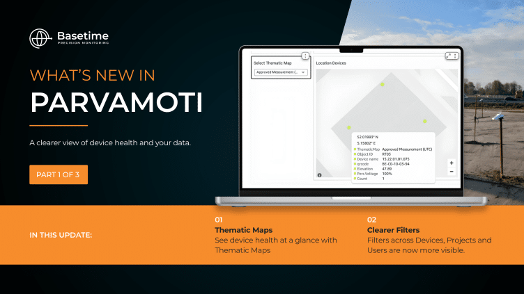
thematic maps in parvamoti

The Health dashboard now includes a Thematic Map function, giving users a faster visual overview of device performance across a project.

Select the information you want to review, such asย energy levels, approved measurements or other device-health data, and the status of each device is displayed directly on the map. The Health dashboard already brings together information including approved measurements, temperature and energy capacity.

The colours make it easier to understand the situation at a glance:ย dark green indicates optimal performance, light green shows an acceptable status, orange can provide a first warning, for example for energy levels between 70% and 30%, while red highlights devices that may need attention.

This makes it easier to quickly identify where everything is running as expected and where further investigation may be needed, without reviewing every device individually.

02. Filters are easier to see

Filters across Devices, Projects and Users are now more visible.

This makes it clearer which information is currently being displayed and helps users quickly adjust their selection when working across multiple devices, projects or users.

Less searching, fewer clicks and a clearer overview of the information that matters.

Clearer information, easier navigation

Both improvements are designed to make everyday work in Parvamoti more straightforward: giving users a clearer overview of their monitoring data and helping them get to the information they need faster.

Already using Parvamoti? Log in and explore the latest updates.

Want to learn more about Parvamoti? Visit our website here to discover more, or contact a member of our team here to discuss how Parvamoti could support your monitoring projects at https://basetime.nl/en/contact/.

Read more?

Whatโ€™s new in Parvamoti? Part 3 of 3: View Movement Parallel and Perpendicular to Your Asset

For Object Monitoring projects, movement can now be viewed in relation to the actual direction of the asset.

By defining the Angle Linear Asset, Parvamoti can visualise displacement parallel and perpendicular to the structure, making it easier to understand whether movement is occurring along or across bridges, railways, roads and other linear assets.

A clearer way to interpret movement. More context for your monitoring data.

Lees meer

Part 3 of 3: View Movement Parallel and Perpendicular to Your Asset

Introducing Alerts in Parvamoti

Monitoring shouldn’t mean continuously checking a dashboard to see whether something has changed.

With Alerts in Parvamoti, users can define relevant movement conditions and automatically notify the right people by email, SMS or both when those conditions are met.

That means less time spent manually checking monitoring dashboards, greater oversight of changing conditions and more focus on what happens next.

With the latest Alerts V2 update, weโ€™ve expanded this functionality with more precise device targeting, new movement comparison options, clearer threshold guidance and a simpler configuration flow.

Itโ€™s another step towards our goal of making Parvamoti a more proactive monitoring platform, moving from reliable monitoring data towards timely information and action.

In our latest newsletter, we introduce Alerts in Parvamoti and take a closer look at what the new functionality offers.

Lees meer

alerts in parvamoti

Whatโ€™s new in Parvamoti? – Part 2 of 3: Understand settlement relative to your project baseline

In the second part of our Parvamoti update series, weโ€™re highlighting the ๐—ฅ๐—ฒ๐—น๐—ฎ๐˜๐—ถ๐˜ƒ๐—ฒ ๐—ฆ๐—ฒ๐˜๐˜๐—น๐—ฒ๐—บ๐—ฒ๐—ป๐˜ ๐˜ƒ๐—ถ๐—ฒ๐˜„ ๐˜„๐—ถ๐˜๐—ต๐—ถ๐—ป ๐˜๐—ต๐—ฒ ๐—ฆ๐—ฒ๐˜๐˜๐—น๐—ฒ๐—บ๐—ฒ๐—ป๐˜ ๐—ฅ๐—ผ๐—ฑ ๐—ฑ๐—ฎ๐˜€๐—ต๐—ฏ๐—ผ๐—ฎ๐—ฟ๐—ฑ.

This allows users to analyse soil level and ground plate height relative to the initial project baseline, making it easier to follow settlement development and recognise movement trends over time.

The dashboard also brings these measurements together visually, with the option to review individual measurements, averaged values and export the data for further analysis.

Read Part 2 to learn more about how Relative Settlement provides clearer context for settlement monitoring.

Lees meer

Manual vs. Automated Settlement Monitoring: Which Method Fits Your Project?

๐—–๐—ต๐—ผ๐—ผ๐˜€๐—ถ๐—ป๐—ด ๐—ฏ๐—ฒ๐˜๐˜„๐—ฒ๐—ฒ๐—ป ๐—บ๐—ฎ๐—ป๐˜‚๐—ฎ๐—น ๐—ฎ๐—ป๐—ฑ ๐—ฎ๐˜‚๐˜๐—ผ๐—บ๐—ฎ๐˜๐—ฒ๐—ฑ ๐˜€๐—ฒ๐˜๐˜๐—น๐—ฒ๐—บ๐—ฒ๐—ป๐˜ ๐—บ๐—ผ๐—ป๐—ถ๐˜๐—ผ๐—ฟ๐—ถ๐—ป๐—ด ๐—ถ๐˜€๐—ป’๐˜ ๐—ฎ๐—น๐˜„๐—ฎ๐˜†๐˜€ ๐˜€๐˜๐—ฟ๐—ฎ๐—ถ๐—ด๐—ต๐˜๐—ณ๐—ผ๐—ฟ๐˜„๐—ฎ๐—ฟ๐—ฑ.

The right approach depends on your project, your monitoring requirements, and the information your team needs to make confident decisions.

In our latest LinkedIn Newsletter, we explore the key differences between both methods, the questions worth asking before choosing an approach, and how real projects have benefited from automated monitoring when frequent, reliable insight was needed.

How do you decide when it’s time to move from manual to automated monitoring?

Lees meer